Why Some Colors Make You Look Tired (and Others Don't)
Some shades light up your face and others drain it, and it is not random. A plain-language guide to color seasons, what they explain and where they help.
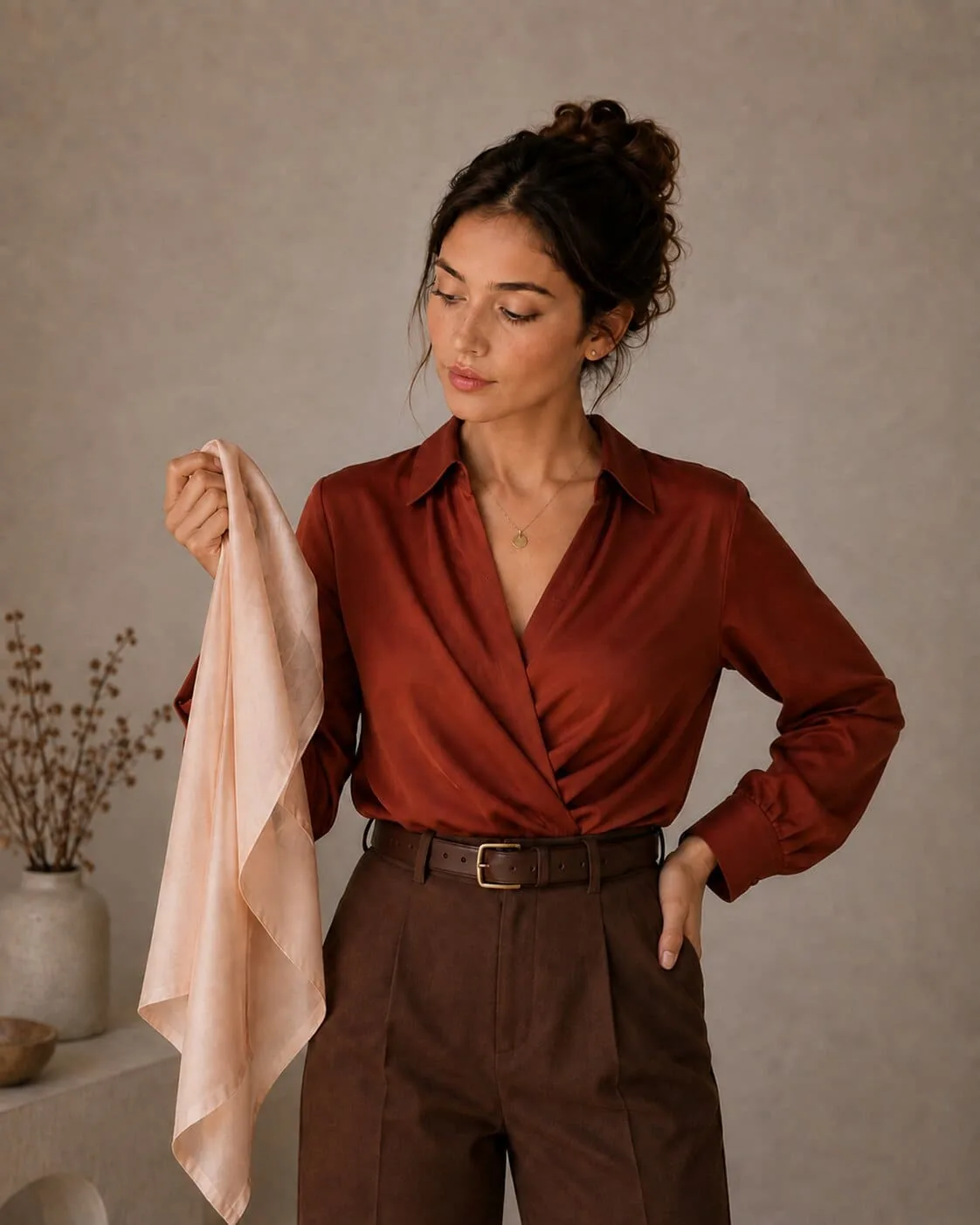
You have almost certainly owned a shirt like this. Good fabric, good fit, a color you liked on the hanger — and every single time you wear it, someone asks whether you slept badly. Meanwhile there is another shirt in the same wardrobe that gets you a compliment every time, and you have never quite worked out why.
It is not the shirt, and it is not your face. It is what the two do to each other.
What is happening on your face?
Fabric near your chin is a mirror. It picks up the light in the room, tints it, and throws it back up onto your jaw, your cheeks, and the skin under your eyes.
If that returned light works against your skin's undertone, the contrast between your skin and the shadows on it increases. The hollows under your eyes go darker. The lines around your mouth get a little more definite. Your skin tone looks patchier than it did five minutes ago. Your brain does not describe any of that in technical terms — it just says you look tired.
Get the tint right and the effect reverses. The shadows flatten out, your skin looks more even, and your eyes look clearer. People tend to compliment the garment, because that is the thing they can see. The garment is only doing the reflecting.
This is why the effect is strongest for anything worn near the face: shirts, scarves, glasses frames, earrings, lipstick, hair color. A shoe can be any color it likes.
Which three questions decide your colors?
Every color analysis method, from a two-hour draping session to a browser tool, is trying to answer the same three questions about your natural coloring.
| Scale | The question | Why it matters |
|---|---|---|
| Warm or cool | Does your skin lean golden and peachy, or pink and blue? | Decides the version of every color — warm red or blue red, ivory or pure white |
| Light or deep | How dark is your natural coloring overall? | A shade can be the right temperature and still be too heavy or too washed out for you |
| Soft or bright | How much contrast is there between your skin, hair, and eyes? | High-contrast faces carry vivid color; softer faces are overwhelmed by it |
Four seasons only answer the first two questions, which is why the classic spring-summer-autumn-winter split so often feels too vague to shop with. Adding the third scale splits each family into three and gives you 12 seasons — specific enough that two people who both call themselves "summer" get genuinely different recommendations.
Where does knowing your color season help?
The reason this idea keeps spreading is that it is not really a beauty topic. It is a shopping topic, and it shows up in every category where you have to choose a color without seeing it on yourself.
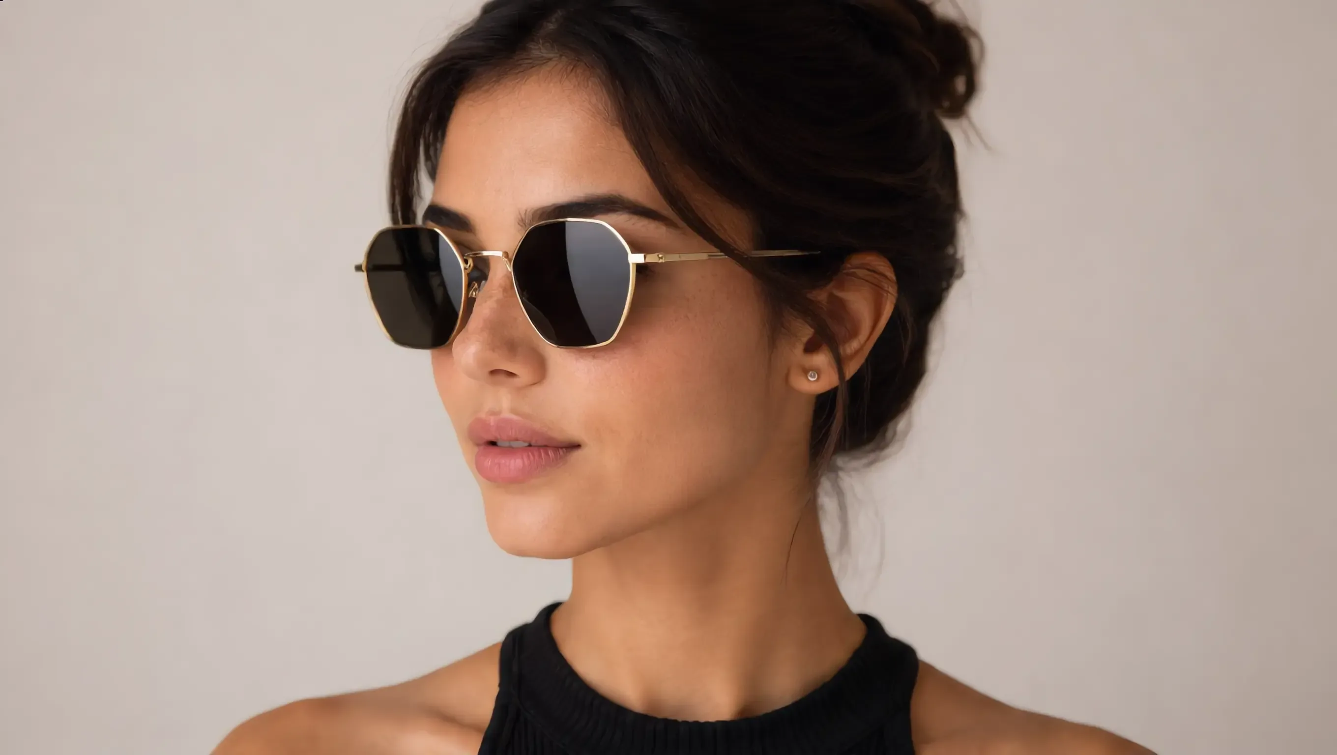
Glasses. Frames sit closer to your eyes than anything else you own and stay there all day. A tortoiseshell wall in a store has warm ambers and cool greys mixed together, and they are not interchangeable. Once you know your season, that wall becomes a handful of frames — and pairing it with face shape answers the color and the silhouette in one go.
Makeup. The hardest thing to buy online, and the thing most often sent back. Foundation undertone, lipstick family, blush, eyeshadow — all of them follow warm–cool and light–deep. A 60-shade grid becomes a handful of candidates.
Clothes. Not "wear blue" but which blue. People who know their palette end up with a wardrobe where things quietly go together, because the pieces share a temperature.
Hair color. Ash or golden, lighter or deeper. Both a client and a colorist benefit from setting that expectation before the appointment rather than discovering it afterwards.
Jewelry. Yellow gold, rose gold, white gold, platinum. Warm or cool settles most of that in about two seconds, and it matters more here than almost anywhere else because the pieces are expensive and worn for years.
Stylists and consultants. An instant season is a natural first step: it gives someone a real answer immediately, and people who have already seen the method work on themselves are far easier to book for the full consultation.
If you sell clothing, eyewear or jewelry
The version of this problem your customers have is simple: they like the product and they are not sure about the color, so they either buy nothing or default to the safe neutral. Both outcomes cost you.
Giving them a season turns your catalog into a shortlist. It also gives you something you rarely get online — a preference the customer handed over willingly, which you can store against their profile and use for the next campaign. And because a palette spans categories, one product view naturally opens the rest of your range: the frames, then the metal, then the lipstick that all sit in the same family.
The seasonal color analysis tool does the read from a single photo in the browser, and the documentation covers dropping it onto a product page.
Makemetryon’s seasonal color analysis places shoppers in one of 12 seasons from one photo and sends the result to your store, so you can recommend frames, metals and clothing in shades that suit them. Try it free.
The short version
You are not imagining it. Some colors really do make you look tired, and the reason is ordinary physics rather than anything about you. Your natural coloring has a temperature, a depth, and a level of contrast; shades that agree with those three things let your face look like itself, and shades that fight them make your face do the work.
Knowing which is which does not mean throwing out your wardrobe. It mostly means that the next time you are standing in front of a wall of frames, or a grid of 60 foundations, you can skip most of them without a second thought.
Frequently asked questions
Why do some colors make me look tired?
Because your face reflects whatever sits next to it. A shade that clashes with your natural undertone pushes the shadows under your eyes and around your mouth forward, so they read as tiredness. A shade that agrees with your undertone does the opposite — the shadows soften and your skin looks more even. Nothing about your face changed; only the light bouncing back onto it did.
How can I tell if I have warm or cool undertones?
Look at your skin in daylight, not under a bulb. Hold a piece of pure white paper and a piece of cream paper near your face and see which one makes your skin look healthy rather than grey. Another quick check is jewelry: if silver looks crisp on you and gold looks slightly muddy, you are probably cool, and the reverse suggests warm. These checks are rough, which is exactly why a structured analysis exists.
What is a color season?
A color season is a shorthand for the palette that suits your natural coloring. It is worked out from three things — skin undertone, eye color, and natural hair depth — placed on three scales: warm or cool, light or deep, soft or bright. The combination lands you in one of 12 seasons, and each season comes with a set of shades that flatter you and a set that fight you.
Does a color season mean I can never wear other colors?
No. It is a guide, not a rulebook. A season tells you which version of a color works best on you — which white, which red, which navy — rather than banning whole colors. Most people use it to buy the pieces that sit closest to their face with confidence, and stay relaxed about everything else.
Can color analysis be done online instead of in a studio?
Yes. A traditional draping session in a studio is thorough but costs time and money, and most people never book one. Reading undertone, eye color, and hair depth from a single photo gives you the same three answers in seconds, in the browser, which is why online stores now put it directly on the product page.
Which businesses use seasonal color analysis?
Opticians and eyewear stores use it for frame color, beauty brands for foundation and lipstick shades, fashion retailers for clothing and wardrobe building, salons and hair brands for color services, and jewelers for choosing between yellow gold, rose gold, and white metals. Personal stylists use it as a free first step that leads into a paid consultation.