Why a Ring Never Looks the Same on Your Hand as in the Photo
Product photography flatters rings in predictable ways. Here is what a studio shot cannot tell you about scale, proportion, and how a ring sits on a real hand.
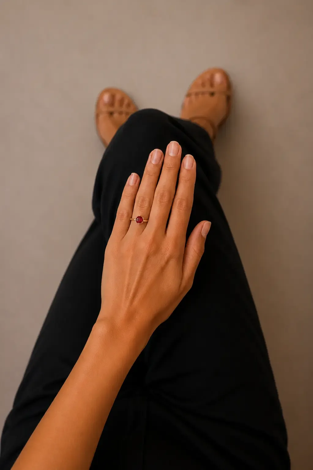
Almost everyone who has bought jewellery online has had the same moment: the parcel arrives, the ring goes on, and it is somehow not the ring in the photograph. Nothing was misrepresented. The stone is the stated size, the metal is the stated metal. It just looks different.
That gap is predictable, and understanding it explains why ring returns are so often about appearance rather than defect.
Scale: the missing reference
Jewellery photography is a genre with strong conventions. Shoot on white or black, magnify heavily, light from multiple angles, remove distractions. It produces a clean, desirable image — and it strips out every cue the visual system uses to judge how big something is.
Look at a ring in a shop and you have context automatically: the tray, the assistant's hand, your own hand a few centimetres away. Look at the same ring at 2000 pixels on a white background and there is nothing to compare it against. The brain fills the gap by assuming the object roughly fills the space it occupies in the frame, which is why a 6 mm centre stone can look commanding online and restrained in daylight.
Retailers know this and often add a millimetre figure or a coin comparison. Both help, and both solve only half the problem.
Proportion: what millimetres do not tell you
Size is absolute. Proportion is relative — and proportion is what people actually respond to.
| Variable | Effect on how the ring reads |
|---|---|
| Band width | A wide band takes up more of the finger, making the same stone look smaller |
| Finger width | The identical ring covers far more of a slim finger than a broad one |
| Knuckle size | A ring sized to pass the knuckle can sit loose and rotate, changing its presentation |
| Setting height | A high setting catches more light and reads larger from across a room, lower from above |
| Metal tone vs skin | Yellow gold advances against cool skin tones; white metals recede |
None of these appear in a specification table. All of them are obvious within two seconds of putting the ring on.
Light: studio conditions are not living conditions
The last variable is lighting. Product shots use controlled, multi-source lighting designed to maximise sparkle and eliminate harsh shadow. Real life is a single overhead bulb, or grey daylight through a window, or a restaurant at dinner.
This matters most for stones. A diamond's sparkle is a function of how many light sources it has to work with — why diamonds look dull in photos covers the optics of that in detail. For rings specifically, the practical consequence is that a stone which looks lively in the listing will be quieter at your kitchen table, and that is normal rather than a sign of poor quality.
What actually closes the gap
The reason in-store shopping converts so well for jewellery is not expertise or atmosphere. It is that trying a ring on answers scale, proportion, and light simultaneously, in about two seconds, with no interpretation required.
AR try-on reproduces that specific moment. Hand tracking locates the finger and its orientation, the ring model is rendered at true physical scale on it, and the shopper sees the actual proportion against their actual hand — including the parts a spec sheet cannot describe, like how a wide band sits against a slim finger.
For jewellery retailers
Three practical notes if you sell rings online.
Publish proportion, not just dimensions. Band width in millimetres alongside stone dimensions costs nothing and pre-empts a common surprise. Shoppers cannot infer it from a photo.
Show more than one hand. If you shoot on models, showing the same ring on two clearly different hands does more for confidence than another angle of the same one.
Put try-on where the doubt is. The hesitation happens on the product page, at the moment of comparing two similar rings. A try-on link buried in a help section is a link nobody clicks. The widget documentation covers embedding it directly on the product page, and the ring try-on page shows what the shopper experience looks like.
Appearance-driven returns are expensive in jewellery specifically, because the items are high value and the restocking is manual. Anything that moves the disappointment from after delivery to before checkout pays for itself quickly.
Frequently asked questions
Why do rings look bigger in product photos?
Jewelry is nearly always photographed on a white background at high magnification, often on a hand model with slim, long fingers. Nothing in the frame gives a familiar sense of scale, so the brain defaults to reading the object as larger than it is. A 6 mm centre stone can look substantial in a studio shot and modest in daylight.
Does a wider band make a ring look smaller?
It changes the proportion rather than the size. A wide band occupies more of the finger, so the same stone reads as smaller against it. Narrow bands do the reverse. This is one of the main reasons two rings with identical stone dimensions can look quite different once they are on a hand.
Does finger size change how a ring looks?
Considerably. The same stone on a size 4 finger and a size 9 finger occupies very different proportions of the visible hand. Product photos are usually shot on small hand-model fingers, which is the most flattering case and rarely the average one.
What is the best way to judge a ring before buying online?
See it at true scale against your own hand. A millimetre measurement, a coin comparison, or a printed template all help with size, but none of them show proportion — how the ring sits against your finger width, knuckle, and skin tone. AR try-on is the only method that shows all three at once.